PROJECT DETAILS
Whitireia
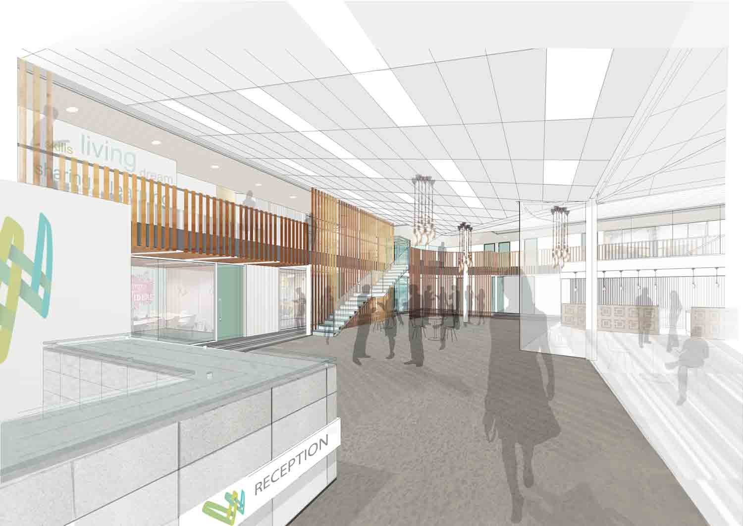
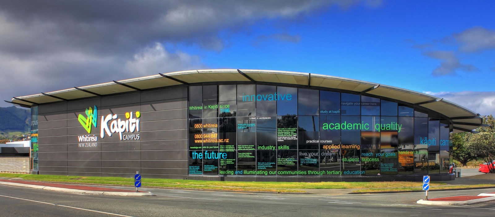
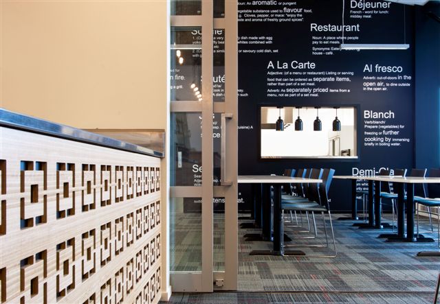
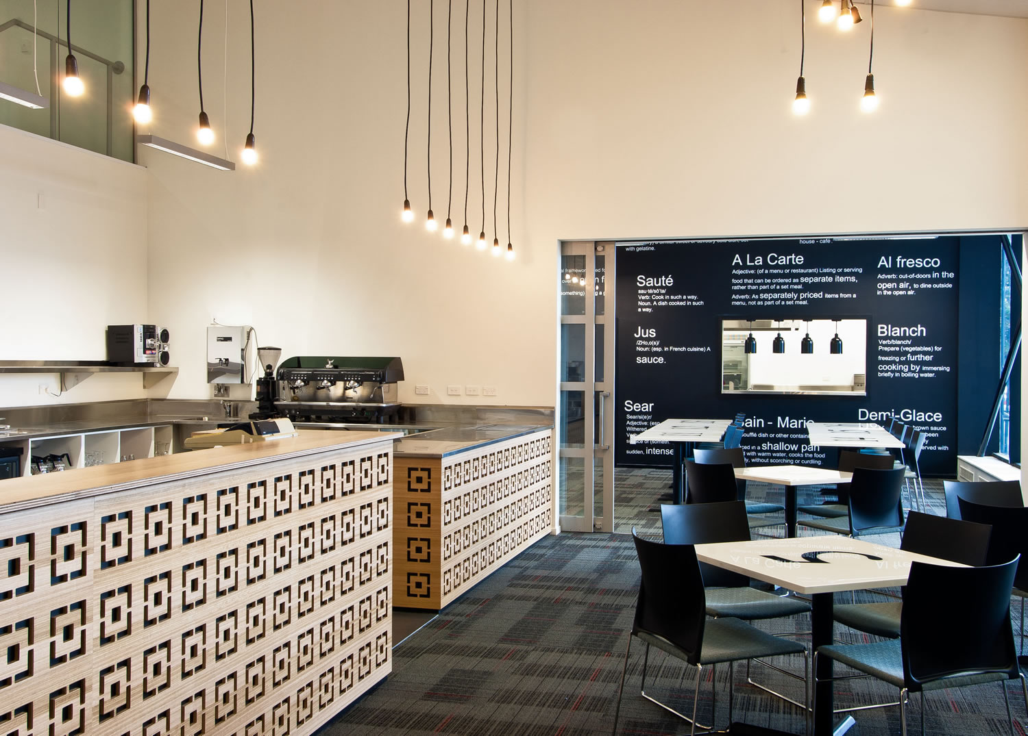
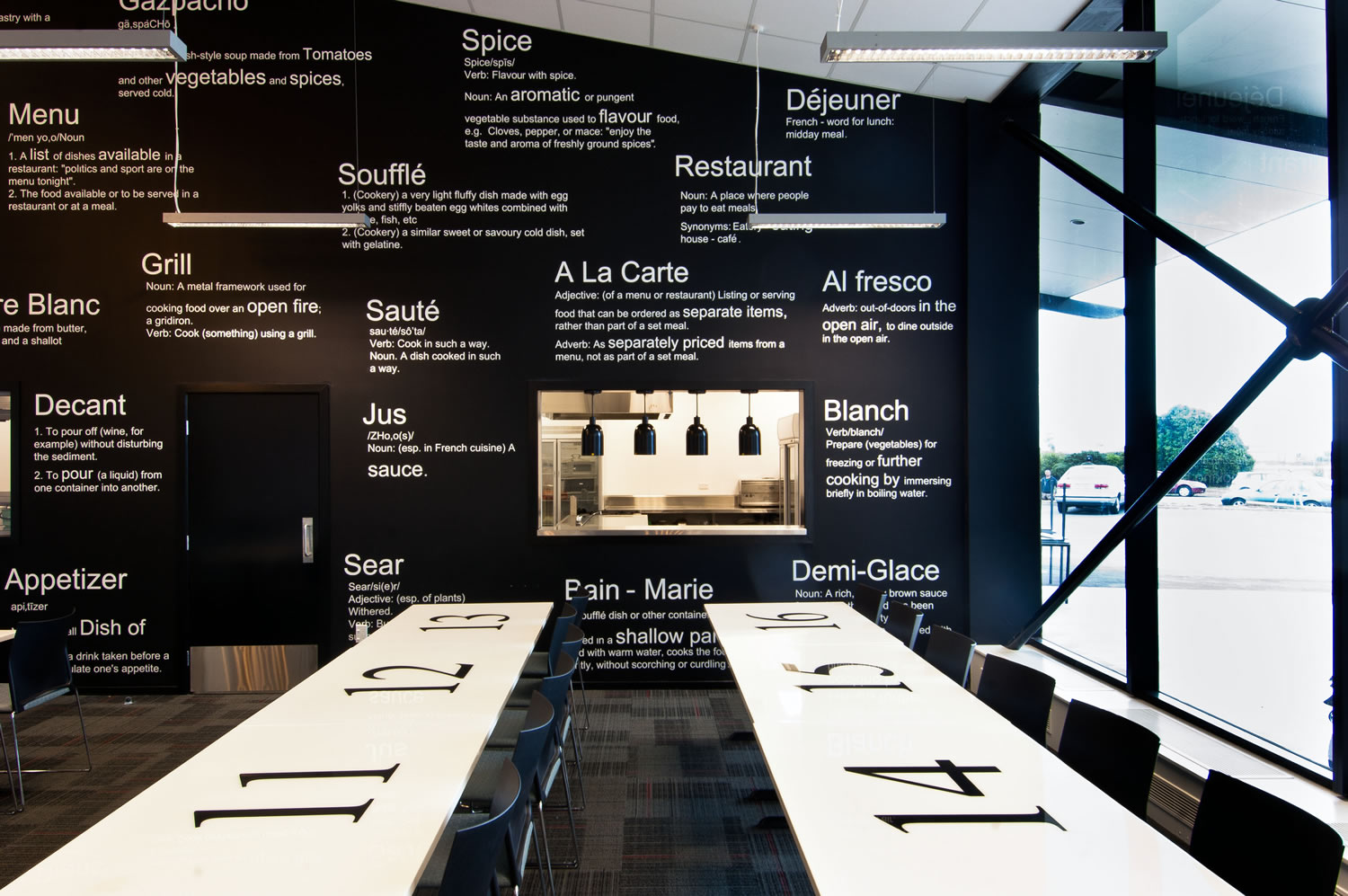
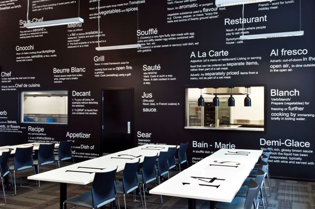
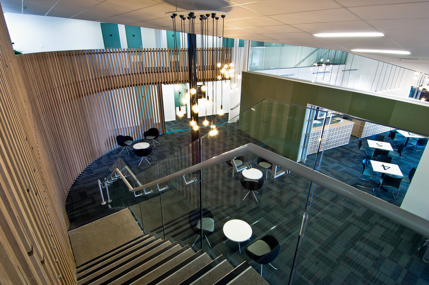
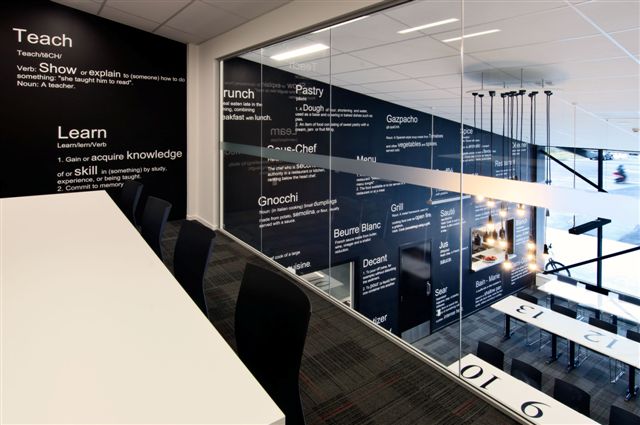
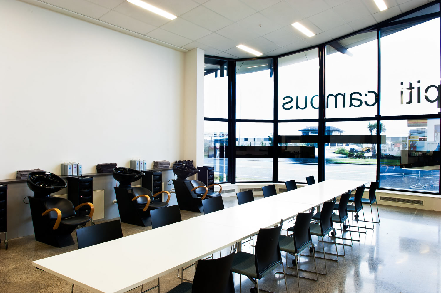
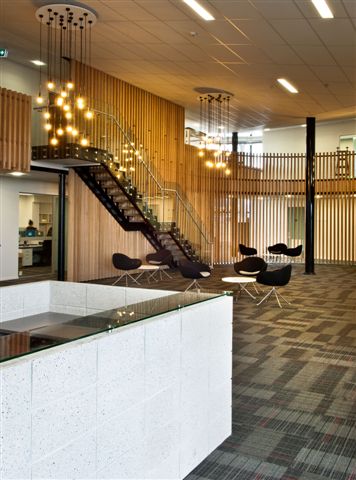
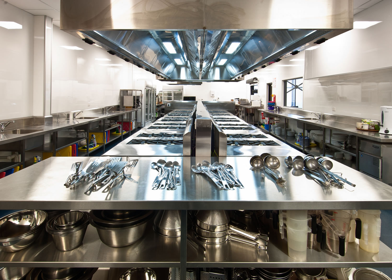
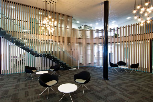
Whitireia required a vibrant and creative Campus; in response a contemporary urban education centre was designed. With the Café, Restaurant, Hair and Beauty salons being the main teaching areas of this facility the focus was to create a “working” learning environment where the public can come in and experience the same standard of care and style they would have in a retail setting. The palate of colours was based around Whitireia’s branding, the Kapiti Community, landscape and artistic spirit, keeping it focused on muted “earthy” tones with bright ‘pops’ of colour. These colours accentuate the large black wall (Resene “Nero”) that runs between the kitchen and the café, and up over to the mezzanine classroom. This wall can be seen from most of the main hub areas within Whitireia and is a draw card of interest to the working café. Playing on the idea of a ‘black board’ wall for the restaurant teaching space, a white graphic treatment was overlaid on the double height ‘Nero’ wall. The treatment employs many commonly used restaurant terms as dictionary definitions, thus helping break up the dark colour. Accents of Tasmania Oak feature throughout Whitireia’s fit-out, separating the mezzanine and the offices from the main reception, these add to the natural feel of the space, and create a textural aspect to the large open student hub. The timber is sealed in Resene Aqua Clear Satin.


